Comic and manga styles now look like printed pages
The American comic, manga, cartoon and European looks now draw the way their printed pages did, with flat colour, simple backgrounds and depth from the panels themselves, instead of glow, mist and painted scenery.
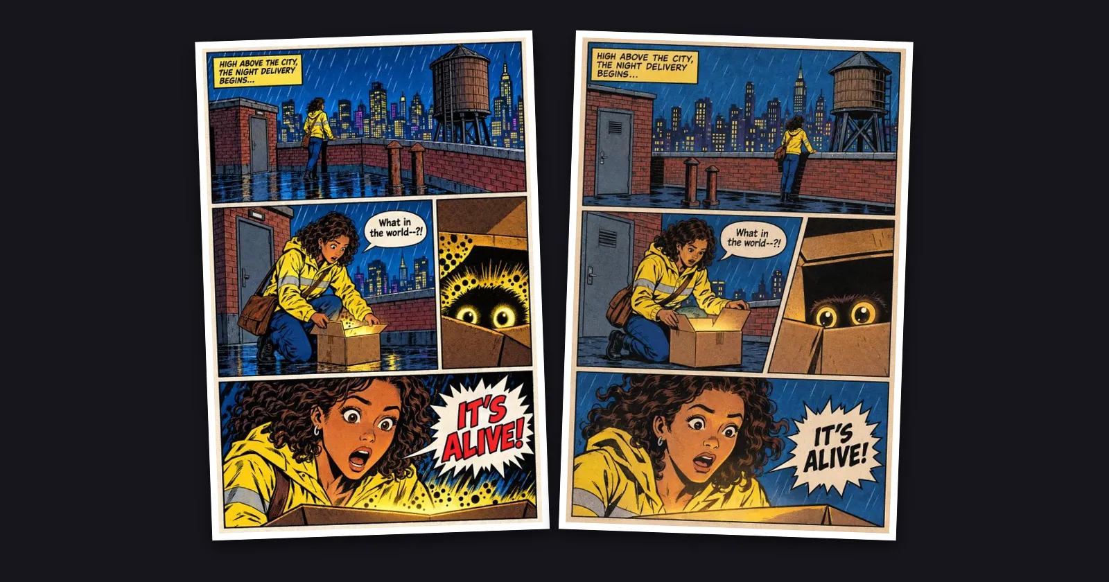
What changed. The printed looks (Superhero, Noir, Golden Age, Kirbyism, Graphic novel, all five manga looks, Cartoon and Ligne claire) had a habit of drifting towards glossy digital paintings: glowing sparks, misty mountains, wet shine and light rays. They now describe the page the way it was really made, drawn by hand and printed. That means flat colour, solid black shadows, simple backgrounds, and depth that comes from overlapping figures, panel shapes and characters breaking out of their frames. The picture above shows the same Kirbyism scene before (left) and after (right).
Manga stays black and white. Manga pages now keep to black ink, white paper and screentone far more reliably, even when your characters are described in colour, such as a yellow jacket or red hair. Chibi draws everyone in chibi proportions, whatever build their sheet gives them.
Page after page. When you draw several pages in a row, each page still carries over who is there, what they wear and where they are from the page before, but takes its look from your series style. That way extra shine doesn't build up from one page to the next.
Your series. If your series uses one of these looks unchanged, it switches to the new wording on its own. If you edited the wording, your version stays exactly as you wrote it. The sample pictures in the style picker have been redrawn as full pages, with a character, a place and speech bubbles, so they show what your pages will look like. Webtoon, Anime colour, Storybook and Painted album are meant to look painted or digital and are unchanged.